How to Boost Your Ecommerce Conversion Rate
What is the special ingredient that turns a browser into a buyer? Why do some visitors spend several minutes on your website and others only seconds? What are people thinking when they put something in their cart and then abandon it? If you knew the answers to these questions, you’d be a millionaire, right?

Converting browsers to buyers is incredibly difficult. Even when done well, it’s a miserably low rate. According to an ongoing study of 3,036 Shopify stores, the average conversion rate (visits that resulted in purchases) in 2022 was 1.3%. Anywhere between 0.2% and 3.2% would put you in the middle 60% of ecommerce stores according to this benchmark. If you’re on the low end of this scale, there’s room for improvement. The good news is that nudging this number up, even just a bit, can reap tremendous rewards.
Today we’re going to look at how to calculate ecommerce conversion rates, identify some things that may be turning customers away, and what you can do to improve conversion rates.
What is an Ecommerce Conversion Rate?
An ecommerce conversion rate is the percent of visits (or sessions) to your website that result in a sale. (You can also track conversion rates for other actions you want customers to take, such as email signups or social followers, but an ecommerce conversion rate commonly tracks those that result in a purchase.)
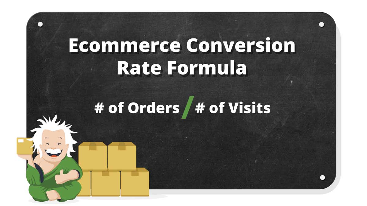
Note that the number of visits (also called sessions) is not the same thing as the number of visitors. A potential customer might visit your web store multiple times before making a purchase. In fact, studies show that the more expensive your product or purchase type (such as a subscription), the more visits they will make before purchasing. In this case, you might want to track conversion rates for visits as well as visitors. But the most commonly used benchmark tracks purchases by visits.
Conversion Rates by Industry
It’s also important to note that conversion rates vary by industry and product category. So what you may think is a low conversion rate may actually be pretty good for your product category.

How to Track Ecommerce Conversion Rates
In order to measure your conversion rate, you need to collect the right data, track it for at least a year to set a baseline, and utilize powerful analytics tools to help you make sense of it. So, what is the right kind of data and how do you gather it? There are dozens of metrics that your ecommerce businesses should be tracking, but only a few that pertain to specifically to conversion rates:
- number of visits (traffic)
- number of orders (transactions)
Tracking these two metrics allows you to calculate your ecommerce conversion rate, and establish it as an ecommerce key performance indicator (KPI). If you want to improve your conversion rate, however, you’ll need to cast a wider net. You’ll need to understand how much traffic you’re getting and where it’s coming from. You should track traffic from each marketing channel, each ad campaign, and even each individual ad to evaluate which ones are working and which ones aren’t. You’ll want to know what your customers are clicking on when they get to your website, as well as when and where they’re leaving so that you can try to figure out why.
Here is a more inclusive list of the metrics/KPIs to track that will help you optimize your conversion rate:
- Traffic (visits)
- Traffic Source
- Transactions (orders)
- Conversion Rate
- Bounce Rate
- Clicks
- Click-through Rates
- Abandoned Cart Rate
- New vs. Returning Visitors
- Average Session Duration
Tracking Tools
There are many analytics tools you can use to track these metrics. Ecommerce systems, web host systems and analytics systems (including Shopify, GoDaddy, or Google Cloud Platform, to name a few) will have tools that measure the basics. This includes traffic, time of visit and IP address, device or browser, session duration, website performance and referral data (the search engine used, or external link that a visitor clicked to arrive on your website).
If you want to go deeper, adding a tool such as Google Analytics will give you a more detailed picture of where visitors are coming from and what they’re doing when they’re on your website. You can track traffic by organic vs. paid search results. Adding unique tracking codes to digital display ads enables you to track click-throughs by campaign or marketing channel. Other analytics tools such as Segment, Heap and Triple Whale can be used to aggregate data from multiple sources including social media ads and search activity.
Once a visitor arrives on your website you can identify the landing page, each successive page they visit, how long a visitor stays on a page, and how far they scroll down. Heatmaps can show you where they spend the most time on each page. You’ll know what page they were on when they ended their session, and what they clicked on before making a purchase. Each of the analytics tools mentioned above offers customized reporting that can help you make sense of the data and identify trends over time or problem areas that you should explore.
Where Should You Start?
There is no single, quick fix to improve ecommerce conversion rates because each website is unique, and each visitor is looking for something different. Some visitors are just browsing or comparing prices and not ready to make a purchase, no matter how tempting your products are. Some may have clicked on an ad because they liked the product shown, but couldn’t find it when they got to your website. Some may think your prices are too high, or balk when shipping costs are added. You can’t make everybody happy, but there are plenty of things you can do to reduce frustration and friction in the shopping process. Start with asking the right questions of the right people.
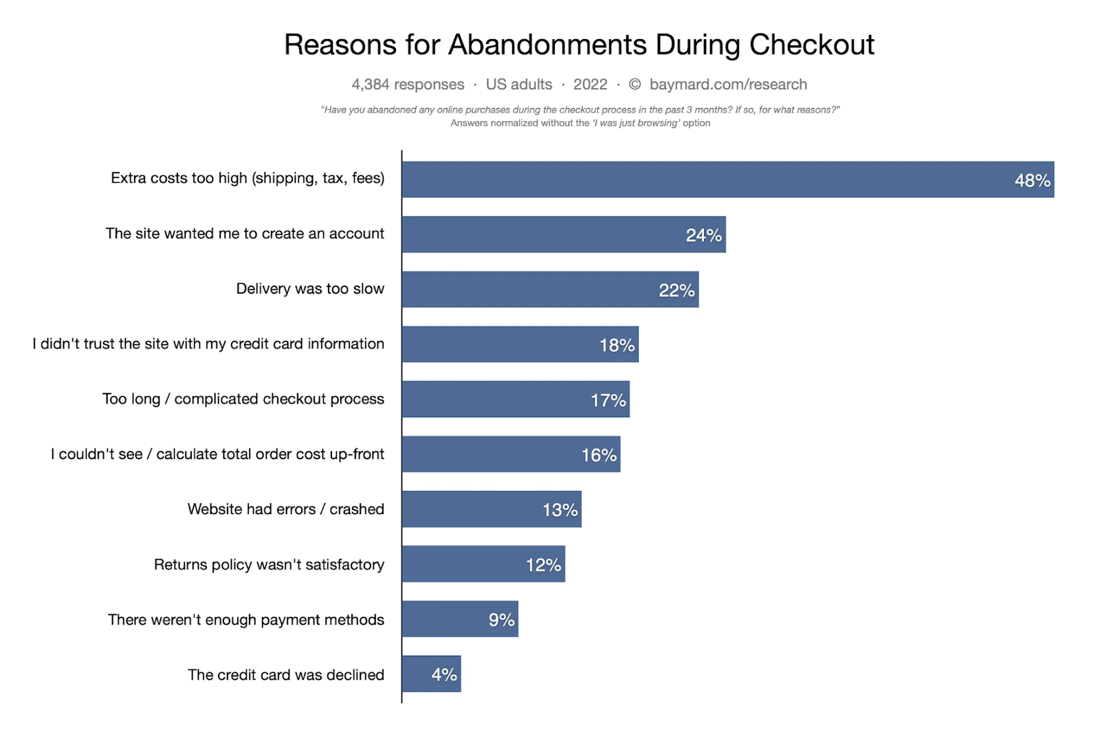
Reasons for Cart Abandonment
Dozens of studies have been done that identify the main reasons visitors abandon products in their cart. You’ll find a different abandonment rate depending on which study you look at. Baymard aggregated the data from 48 different studies to arrive at an average cart abandonment rate of 70% across all ecommerce websites for visitors on a desktop. It’s even higher for those on a mobile device (86%) or tablet (81%).

Photo Credit: Judy Coleman
Of those who abandoned, the number one reason (at 58%) cited was, “I was just browsing.” Baymard then removed those answers from the results to focus on the customers who were actually intending to make a purchase, but didn’t. Not only were their reasons for abandoning their carts very specific, most of them were also pretty easy to fix.
Start with Your Checkout Process
There are a myriad of reasons that a visitor to your website might leave before purchasing anything. But for the serious shoppers who actually put items in their cart, the list is much shorter and easier to handle. If you want to improve conversion rates, you should start with the low-hanging fruit: your checkout process.
- Offer Free or Discounted Shipping – Sticker shock at seeing the total price is the reason cited for 48% of abandoned carts. If the same item is available at a brick-and-mortar store nearby, high shipping costs will result in an abandoned cart. Therefore, if you can’t offer everyone free shipping, then at least offer a tiered discount that offers free shipping above a certain order threshold, or reward frequent shoppers or first-time customers with free shipping.
- List Shipping Options by Delivery Date – Descriptions such as ground shipping, standard shipping, and expedited shipping don’t give customers enough information to make a decision. Saying 5-7 business days is ambiguous, and forces them to stop in their tracks and do the math. Let’s see, does that include processing time? Do Saturdays count? Is Monday a holiday? List your shipping options by the estimated delivery date to prevent confusion and disappointment when expectations aren’t met. Plus, it cuts down on the amount of information a customer has to wade through to make a decision, and cleans up the look of your checkout page.
- Enable Guest Checkout – If someone is in a hurry, guest checkout may make the difference between a sale and an abandoned cart. Furthermore, many people put products in a cart simply to see how much an order is going to cost with shipping and tax. If you force them to fill out a long form, or give up their email address or phone number just to do this, you may lose the sale.
- Show Estimated Shipping Costs on Product Page – Allow visitors to enter a ZIP code to see estimated shipping costs earlier in the process, i.e. before having to fill out the checkout form. If shipping costs are high, it might not improve your conversion rate, but if they’re reasonable, it might reduce your abandoned cart rate. If you offer free shipping, with or without a threshold, this info should be highly visible on every product page and in your website header, if possible.
- Welcome Discount – If you offer a welcome discount to first-time customers in exchange for an email address or cell number, then don’t wait 24 hours to send the email or text discount. They wouldn’t have given you their contact info if they weren’t ready to buy.
- Simplify Checkout Forms – There are only 8 things an ecommerce business needs to know to process a payment: full name, address, ZIP, country, email, phone number, credit card number, and security code. (City and state can be auto-filled from the ZIP code.) If you’re asking for more information than that, or specifying a certain format or punctuation, you’re overcomplicating the process. Of course, if the billing address differs from the shipping address there will be additional fields, but the customer should never have to type in the same information twice.
- Offer Alternative Payment Options – Shopping apps such as PayPal and Shop Pay save shipping addresses and payment methods so the customer can checkout with just a few clicks. Other apps, such as Apple Pay, Samsung Pay, and Google Pay enable them to checkout from their phones. Buy-now-pay-later apps such as Klarna and AfterPay enable them to pay in installments.
- Add a Progress Bar – If customers can see where they are in the checkout process, and they’re able to move through it quickly, they’re more likely to finish.
- Keep it Simple – Once a visitor is on your checkout page, avoid distracting them with unnecessary information that will slow them down. This is not the time to upsell or cross-sell merchandise, join the birthday club, or refer a friend. Help them stay on task and make each step clearly flow from start to finish.

Other Ways to Boost Your Conversion Rate
Once you’ve streamlined your checkout process and noted the improvements in your conversion rate, what’s next? Google Analytics, exit surveys, customer service contacts, search terms and social engagement can all help identify areas that cause friction, frustration, or confusion. Let’s start with the product pages.
Product Pages
Product pages include product listings for a certain category, such as “men’s pants” or “bluetooth speakers,” as well as the detail pages for each individual product in the category.
- Product List Pages – Provide enough information about each product that a reader can tell the difference between each product without clicking through to every product page. Descriptive product titles, showing that other colors or size variations are available, and product ratings are all helpful differentiators.
- Product Descriptions – Text on the product detail page should work hard to communicate the product’s features and benefits. It should be written in your brand’s voice, but key information should be easy to find and separated out as a list. This includes fabrics or materials used, dimensions, capacity, weight, battery life, or any other specs a customer might need to know before purchasing.
- Photography – Show off your product from every angle and in every color. Small details and textured fabrics deserve close-up photos, but there should also be at least one photo that shows the product being worn or in use, so the customer can get a sense of its scale. Since customers can’t touch or try on the product, your photos have to do the work for them.
- Videos – You can explain a lot in a video that you can’t in a still photo: how to use the product, how to assemble or install it, how to wear it, how stiff the fabric is or how it flows when you walk, or how the shoes look on someone’s feet. It’s like having a salesperson on every product page.

- Product Comparisons – If your product line includes several similar-but-slightly-different items, offering a compare function lets customers evaluate features and specs of different SKUs side by side, rather than jumping from one product page to another, which can be quite frustrating.
- Size Information – According to Statista, “Didn’t fit” is the most common reason for apparel returns. The more information you can give the customer about the way a certain brand or style fits, the more confident a visitor will be about making a purchase. If you sell different brands within the same category, such as jeans, use the brand’s size chart on each product page, not a generic one.
- Social Proof – Ratings and reviews can reduce anxiety and positively impact conversion rates. Particularly helpful are reviews that include sizing information, such as the customer’s, height and weight, and which size they bought. Testimonials gathered from post-purchase satisfaction surveys can serve the same purpose.
- Live Chat – If you find that customers are spending a lot of time on your product pages without purchasing, perhaps adding a live chat function, staffed by someone who knows your products well, could help answer a question or help them find what they’re looking for.
- Live Data – Adding live data to the product page, such as how many customers have that item in their cart or how many units are left, adds urgency. It also simultaneously acts as social proof that the item is popular. The customer thinks they have to act fast or lose out. (Obviously, this only works when quantities are low. “Only 300 left” isn’t an incentive.)
- Call to Action – Test different wording, size, color, and placement of your call-to-action button. Whether your customer is on a desktop, phone or tablet, they should not have to scroll very far to get to that button. Test that it isn’t hidden by other information, such as a tool bar, menu, or url on every device and every marketing channel.
Landing Pages
A landing page is the page of your website that a customer lands on when they click a link elsewhere. That link might be a text link in a blog post, a link on a search results page, a pay-per-click ad on Google or Facebook, a shop now button on Instagram or any other inbound link. There are a few key metrics that will indicate problems on these pages: bounce rate and click through rate. Bounce rate indicates they didn’t find what they expected to find, and click-through rates indicate interest.

- Meet Expectations – Make sure your landing page conveys the information that was promised in the link. For example, if your ad was promoting a Flash Sale, the landing page should communicate the details of the sale, whether that’s a banner on your home page, or a landing page specially designed for the sale. Another example: if a customer searches Google or Bing for swimsuits, the link in the search results should send them to swimsuits, not your home page (unless you sell nothing but swimsuits).
- Quickly Convey Information – The purpose of a landing page is to quickly help the visitor find what they came for, whether that’s a particular product, a five-star review, or a promo code. If no one is clicking through your landing pages to shop, then there’s a miscommunication between what your links or ads are promising, and what your landing page is communicating. Either you are sending them to the wrong page, your landing page isn’t communicating the key information, or your search metadata and ads (images and text) are building the wrong expectations.
- Call to Action – If you want visitors to shop, make the shop button prominent on your landing page, or link your ads to shoppable landing pages.
User Experience (UX) Issues
It’s pretty easy to identify and eliminate UX issues with your website – assuming someone is watching for them and can fix them. Having an IT person or web developer on staff (or on call) is critical, particularly if you’re not using an out-of-the-box shopping platform. You can also mess up an out-of-the-box shopping platform pretty easily by overcomplicating your navigation menu, loading the wrong photo sizes, and not proof-reading and quality checking the landing pages and product listings you create. You can use Google Analytics to see where shoppers were when they left, track how they navigate your site, and how long they spent on particular pages to identify UX issues, but there’s no substitute for QA checks before going live.
- Slow Loading Time – If your image files are too large your web pages will take forever to load. No one is going to stick around for that, especially if they’re trying to compare several different products.
- Poor Search Function – If your search bar is hard to find or keywords aren’t showing results, you’re shooting yourself in the foot. Search should be the quickest way to find something on a website, even if a customer doesn’t know exactly what they’re looking for. Regularly look at search queries to see the most common search terms used. Allow for user typos, misspellings, vague search terms, and other words that describe the same types of products or related products.
- Responsiveness – Improve the functionality of your website on mobile phones and tablets. All elements on a page should automatically resize, hide, shrink, or enlarge to look the way you want them to on each device. Remember those killer abandoned cart rates (86% for mobile and 81% for tablets)? This is why. If a customer can’t easily move around and find what they’re looking for, they’ll shop elsewhere. Test, test, and test again, every time you change anything.
- Simplify Navigation – Make it easy to find products by simplifying your navigation menu. How simple? That depends on what your ecommerce business is selling and how many SKUs you have. A well-organized navigation menu not only reduces frustration for your customers, it makes your website easier to crawl for search engines, and improves organic search results.
- Standard Navigation Bar: Start with the lowest common denominator for incoming traffic. If you only have a few products, your primary nav menu might only have a few options, such as “shop,” “blog,” “about,” “account.” If you only sell shoes, your nav menu options might be or “men’s,” “women’s,” and “kids’,” in addition to the blog and other important links. No matter how you decide to categorize your products, it’s important to organize them logically, using the fewest number of categories at the top, with sub links for deeper drill-downs. Not so deep, however, that your customer can’t find their way back; it should never take more than 3 clicks to get back to your home page.
- Sticky Menus: These are menus that remain visible at the top of the page no matter where a user is on your website, or how far down they scroll. This makes it easier for them to move around, particularly if they’re on a smaller screen. The downside is that they do take up space.
- Dropdown Menus and Mega Menus: If you sell a lot of different types of products, consider a dropdown menu or mega menu that allows users to choose from multiple options. Make sure these menus are not too overwhelming and that you test them on all browsers and devices. Nothing is worse than a huge dropdown menu that won’t go away.
- Featured Items: Adding links to your navigation menu for featured items, seasonal items, or new items can increase engagement.
- Sort and Filter: On product category pages allow visitors to sort or filter results by product attributes, such as color, brand, category, or price.

Analyzing Your Results
After you’ve made a few changes, you should monitor your ecommerce conversion rate and compare it to the same time period from the previous year. Make only a few changes at a time, so you can tell which ones are generating results. Be sure to factor in seasonality and YOY differences in ad spending for each sales channel.
Segment your results by season, by sales channel, by first-time or returning visitors, by ad campaign or featured product, or by any other method that might help you identify what’s working and what isn’t. You may find that some social media platforms or sales channels outperform others. Some products may bring in new customers while others don’t. Some sales channels might perform better on mobile than on desktop. But keep in mind that more traffic doesn’t necessarily mean higher conversion rates. You may simply be bringing in more disinterested visitors, or first-time visitors who might need more convincing.
So give it time, don’t get discouraged, and keep improving. You will get there! If there’s anything we can do to help, reach out any time.