

Back in April 2013, I asked the question, “Will Supply Chain Software Vendors Start Competing On Design?” Here’s an excerpt:
One of the things supply chain software users like to complain about the most is the user interface (UI). This was true 15 years ago when I started as an industry analyst, and it’s true today. Simply put, many user interfaces…
— are crammed with too many features and too much information that users don’t need or want to accomplish their tasks;
— have non-intuitive workflows that don’t align with the way users are accustomed to working (or the way they want to work);
— force users to open multiple windows and tabs, and click countless times, to accomplish what should be a straightforward task.
Sound familiar?
Although software vendors have invested in improving their user interfaces over the past decade, many companies are still using outdated systems plagued by the problems mentioned above. And in the case of Citibank, this led to a $500 million processing mistake. As Timothy B. Lee writes in Ars Technica:
A federal judge has ruled that Citibank isn’t entitled to the return of $500 million it sent to various creditors last August. Kludgey software and a poorly designed user interface contributed to the massive screwup.
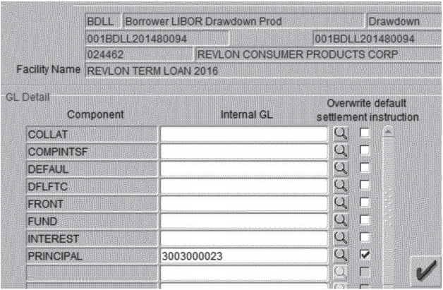
Citibank was acting as an agent for Revlon, which owed hundreds of millions of dollars to various creditors. On August 11, Citibank was supposed to send out interest payments totaling $7.8 million to these creditors…[However], the confusing interface of financial software called Flexcube led the bank to accidentally pay back the principal on the entire loan — most of which wasn’t due until 2023…Citibank had actually sent out almost $900 million, not the $7.8 million it was trying to send.
Citibank then scrambled to get the funds back, notifying each creditor that the principal payments had been made by mistake. Some of the creditors sent the money back. But others refused, leaving Citibank out $500 million.
Here is a screenshot of the Flexcube user interface, which as the article describes, required the user to enter information and check boxes in non-intuitive ways in order for the transaction to process correctly.
If any of your enterprise systems look like they were designed in the Windows 95 era, or make you take a Rube Goldberg approach to processing what should be a simple transaction, then this Citibank story is a warning: you may be setting yourself up for a costly mistake too.
(At a minimum, that outdated and poorly designed user interface is costing you money in lost productivity and longer, more costly employee training).
I’ll just repeat what I’ve been saying for years: software vendors and customers need to think beyond features and functions. Of course, evaluating whether a software application meets your functional requirements remains critically important. But after that list has been checked off, you need to give equal time and consideration to evaluating the user experience. You also need to give power users, the people who have to work and deliver results with the application every day, a greater voice in the purchasing decision.
For related commentary, see “Virtual Digital Assistants In Enterprise Software: The Journey To No Clicks” and “Why User Interfaces For Supply Chain Software Are Getting A Makeover.”