What is Storytelling with Data and How Can You Master it? Get Tips from Cole Nussbaumer Knafflic
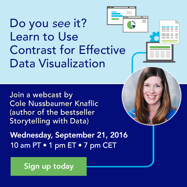
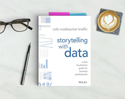
 This month, we hosted a Data Visualization webinar with bestselling author Cole Nussbaumer Knafflic. Cole wrote the popular book “Storytelling with Data” and is also known for her blog. She’s worked at and with some of the most data-driven companies on the planet, including Google, Adobe, Genentech, JPMC, Target, and the World Bank. She also works with organizations and individuals to help them become more effective data storytellers through workshops. We had a chance to talk to her about some best practices for effective data visualization leading up to the webinar. In this short interview, she shares some of her trade secrets and a sneak preview of what you can find in her book.
How do you define storytelling with data?
For me, storytelling with data is the communication step of the analytical process. Let’s consider the analytical process. Perhaps you start off with a question or hypothesis. Then you have to gather the data and clean the data. Next, you analyze the data. At that point, it’s easy to throw it into a graph and be done. But that graph is the only part of the whole process that your audience sees. So it deserves at least as much—perhaps more—attention compared to the other parts of the process, and yet is so often overlooked or given the least amount of time. To take that a step further, my view is that you should never simply show data. Rather, you should make data a pivotal point in an overarching story or narrative. This helps it make sense to your audience, makes it resonate and can help make it stick. This is storytelling with data.
In your opinion, what are the top 3 things to consider for successful storytelling with data?
Number one: consider your audience. Have a clear picture of your audience in mind throughout your design process and aim to make things easy for them.
Number two: use color strategically. Color, when used sparingly and intentionally is one of your most powerful tools for drawing your audience’s attention to where you want them to pay it.
Number three: incorporate words. Use words (whether in your voiceover if presenting live, or written down on the page if the communication is a document being distributed) to make your point clear.
These three things together—considering your audience, using color strategically, and incorporating words to make your point clear—go a long way for effective storytelling with data.
What are some tips to consider when using different graph types (when should you use bar or line graphs, for example)?
Always consider what you want your audience to be able to do with your graph and design to make that easy. Often, this means allowing time to iterate and look at things a few different ways to create that magical “ah ha” moment that graphs done well can elicit.
When it comes to the specific type of graph, I find myself reaching most frequently for the ones we’re all familiar with (for example, lines and bars). There is good reason for this: it means your audience already knows how to read the graph, so they can put their brainpower towards what they are meant to get out of it. In my book, there’s an entire chapter devoted to the 12 types of visuals I use most, with discussion and use cases on each, so check it out for more.
 Would you say it’s important for organizations to have a dedicated specialist for data visualization?
Data visualization and storytelling with data should be a core part of every analyst’s job. I like a two-pronged approach for building organization capabilities in this area. First, upskill everyone, teaching those for whom communicating with data is a core part of their job the fundamentals of effective data visualization. Secondly, invest in some in-house experts. This can be great career development for those individuals as well as provide someone internally for folks to turn to for help when they get stuck.
How can you entice data analysts to become more design-focused?
It’s a great question, and something that can feel like a stretch or challenge for those who are brought up with traditional quant backgrounds. By considering your audience and being thoughtful in the design of your information, you can put yourself in a better position for successfully getting your point across and driving your audience to action. My view is that everyone can have an eye for design and it’s about learning to trust it and learning about what modifications to try when things don’t feel quite right.
Want to learn more about effective data visualization? Watch the webinar recording.


